Download TT Runs Font Family From TypeType

Download TT Runs Font Family From TypeType


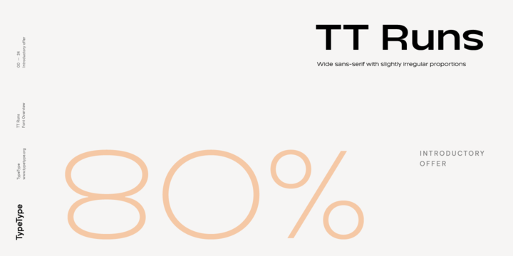
Useful links: TT Runs PDF Type Specimen TT Runs graphic presentation at Behance Looking for a custom version of TT Runs? The TT Runs project started with a fairly simple idea—to create a wide modern sans-serif, which will reflect the sporty style and look good on sportswear. Before proceeding to sketching, we examined the theme of Olympic venues and their identities, and also traced the evolution of “sports” typefaces through different eras and continents. In the end, we came up with the idea of making a typeface that is targeted for application to elastic sports outfits or casual sportswear. This decision has greatly influenced the appearance of the wide and slightly stretched proportions in our typeface, the appearance of the reversed contrast of the shape of some characters relative to the vertical line and their deformation, and the overall plasticity of the letters. TT Runs is very versatile: on the one hand, it is a regular sans-serif that can be used even in a large text array, and on the other hand, it is a bright display typeface with irregular proportions of characters that looks great even in large headings. A striking feature of the typeface is the difference between the top and bottom, the so-called inverse contrast of the shape relative to the vertical line, which is especially noticeable in uppercase characters (for example, in the letters K, C, S, R). In lowercase characters, everything is calmer and more traditional, the reverse contrast of the forms relative to the vertical line is greatly softened and almost invisible. The main visual features of the typeface also include a large vertical height of lowercase characters. Moreover, the bolder the weight of the style, the taller the height of the lowercase character becomes. In addition, when the DemiBold weight is reached, the design of some characters changes, for example, a vertical stroke in bold for characters with a dot at the top bends into an arc. TT Runs consist of 20 styles: 9 upright & 9 obliques, plus 2 variable fonts, each of which includes 739 glyphs. In addition to the broad language coverage in the typeface, you can find a bunch of useful OpenType features. Stylistic alternates, standard and discretionary ligatures, old-style figures, numbers in circles, arrows and much more. Full OpenType list of features: ordn, case, frac, sinf, sups, numr, dnom, onum, tnum, pnum, lnum, dlig, liga, calt, locl, salt, ss01, ss02, ss03, ss04, ss05, ss06, ss07, ss08, ss09, ss10, ccmp, subs.


Download TT Runs Font Family From TypeType


Popular posts from this blog

Download Beletria Font Family From Storm

Download Now Server 1 Download Now Server 3 Download Now Server 2 The goal of Beletria is to be a contemporary looking book typeface for fast reading (frankly, I was already bored of using of good old Baskerville for the volumes I illustrated recently). I needed an inconspicuous typographic element to combine with my pictures. The development of Beletria family took most of 2018 and resulted in 26 styles of classical proportions at 2 optical sizes. It has a large x-height and lively italics. Naturally the usual array of OpenType features is present. Beletria is perfect for electronic publication as well. Download Beletria Font Family From Storm

Download Mansory Font Family From Larin Type Co

Download Now Server 1 Download Now Server 3 Download Now Server 2 Mansory is a modern contrasting and elegant sans serif font, which is presented in an upright and oblique style and also has 4 weights, this gives more opportunities for your design project. Contrasting lines and balanced forms of these fonts will provide recognition and will be easy to read. The regular style is perfect for text, while the heavier ones are perfect for logos, headings or will highlight exactly what you need. Mansory has stylistic alternates and ligatures that are harmoniously combined with the font, with them you can make your project more individual. This font is easy to use and has OpenType features. Download Mansory Font Family From Larin Type Co

Download Thicker Font Family From Zetafonts

Download Now Server 1 Download Now Server 3 Download Now Server 2 Thicker is a type-family designed for  Zetafonts  by  Francesco Canovaro  with  Andrea Tartarelli . A geometric sans typeface on steroids, it was first designed in the muscular extrablack weight with the aesthetics of high-power dynamic typefaces used in sports communication, and then developed in the lighter weights where the shapes show some vintage-inspired proportions and the slightly squared look that nods to Novarese famous Eurostile, eponymous with retro-futurism. With these diverse influences the typeface allows for both impressive display use and effective logo design as well as more fine-tuned editorial use in body text - with a natural inclination for effective and powerful advertising. Sports typography usually uses italics to add dynamism and...